Sunday, April 23, 2023

Color, Compostion, and Push-Pull


Carpe Diem

I painted this still-life without much planning - I just wanted to grab the beautiful array of colors in the flowers and fruit on my kitchen table before they faded away or were eaten.
I'd been reading about the "flat" surfaces of  Henri Matisse as opposed to the depth created by more traditional landscape paintings. So, like a Matisse painting, this painting is flat in terms of atmospheric perspective. There are no shadows or shading so there's no sense of walking into the picture.

However, once I got to working on the left side, I felt it needed a sense of depth for the orange/ bowl of fruit/ vase of flowers because there is no space between them and I didn't want them to to appear as a single flat shape. Decreasing/ overlapping shapes creates that effect to some degree but I wanted to be sure. To my eye they  appear to move back in space in the picture plane. Here's how I resolved it:

A warm, saturated yellow will push forward
For the mangos I mixed the warmest yellow I could using Cadmium Yellow and Cadmium Red Light. There is white mixed in too, which actually increases the intensity of the color to a point- after which it starts to neutralize it. Yellow is of course a warm color to start with, but Cadmium Yellow Light, for instance, is cool..so there's that nuance. I can't recall what colors I used for the pears, something warm.

A cool, greyed or neutralized purple will pull back.
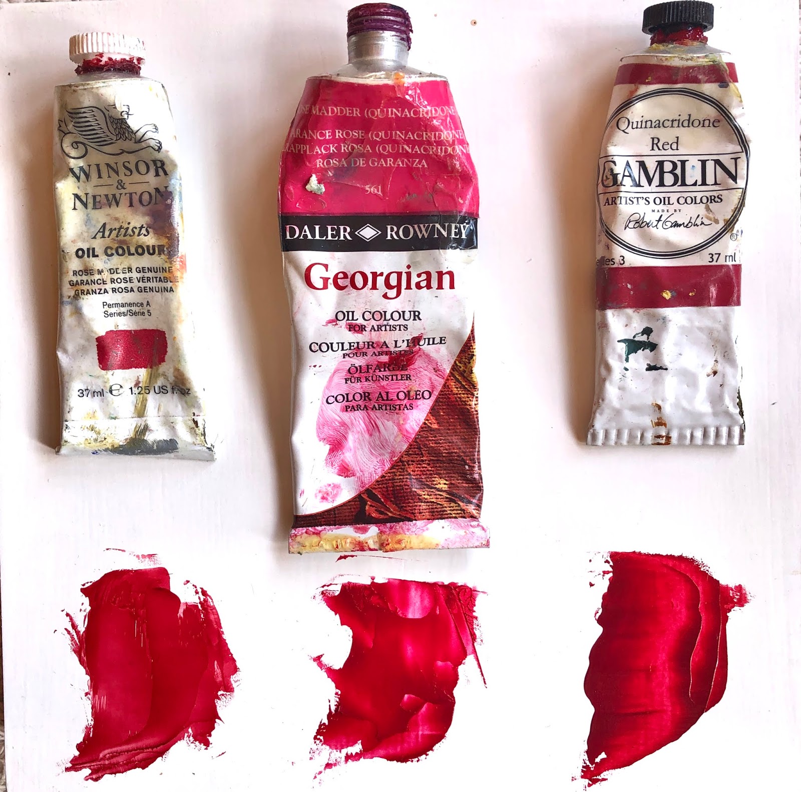
For the vase, I decided to use purple, not the actual gold/brown that it is, because of purple's dynamic color relationship to yellow and to support the push/pull. I use mostly Gamblin oil paints, so I went a bit further to ensure that I used the coolest possible purple for the vase, in this case Dioxazine purple (cool) by referencing this chart:
I could have mixed a cool purple using the Gamblin chart  but I happened to have Dioxazine Purple in my paint box. 
The vase is also greyed/neutralized, which causes the pull of atmospheric perspective. Using the color complement (purple/yellow) will grey/neutralize a color. An even more effective greying complement would be a yellow that tended toward red, such as Cadmium Yellow. However, since that is a warm color, I may have compromised and used Hansa Yellow Light which is a cool yellow. I've integrated this color bias system into my process. It's free, makes sense, and is good info for the next time you paint yourself into a corner as I did:

Everthing I've written here I've learned from trial and error, reading, watching videos, or from other artists and workshops. It's exciting to share it. I hope it helps someone else along the way.


Wednesday, June 3, 2020


Adventures of a Plein Air Artist

A new low; 86'd from the Salinas Train Station. June 3, 2020

I was walking around with my sketchbook under my arm, looking for a spot for another sketch. The station employee asked me what I was doing there, and I explained that I was sketching. She said I'd have to leave because they couldn't have people hanging around there "with all that was going on."
So, I left. I'm glad I got a chance for one sketch. I'm hoping to start a painting. If I have to go back for another look I can park farther away in the parking lot, very low profile... 
At first I thought she was talking about the George Floyd killing and the protests and unrest, but after I left I realized it was probably the COVID 19 virus that was affecting their policies. After she ran me off, she headed over to another loiterer. I heard him say he was waiting for someone to arrive on the train. "Which train, she asked.."
Beautiful old train station, no doubt it has beheld many dark days over the course of its life. Many tears of joy and sorrow.


Saturday, April 25, 2020

Rose Madder Genuine versus Quinachridone Red Oil Paint

Here's a bit of information I found interesting, while comparing my own tubes of colors for this painting.
The Flower Chair background rose color is Daler and Rowney Oil Colour, Rose Madder (Quinacridone).
 "The term Rose Madder is most commonly used to describe the colour made from the Madder Lake pigment which is a traditional lake pigment extracted from the roots of the common madder plant Rubia tinctorum." This and more detailed history on this romantic color at: Winsor Newton Spotlight on Colour: Rose Madder Genuine


Left to Right:
Winsor Newton Artist Oil Colour, Rose Madder Genuine$21.50 for 37 ml (shown)
Daler and Rowney Oil Colour, Rose Madder (Quinacridone) $6.97, 75 ml tube (shown)
Gamblin Artist's Oil Colors, Quinacridone Red $4.77, 37 ml tube (shown).
 * Prices from Dickblick.com, as of 4/25/2020.
Quinacridone is sold is a less expensive substitute for rose madder, but there are differences in color. I will definitely keep all three, but if I want to cover a lot of canvas, I'll opt for the Daler and Rowney.
 
It's hard to discern the subtle color differences on screen, but to my eye, the Winsor Newton is the most beautiful and subtle, the Daler and Rowney a close second in terms of imitating the rose color of the Winsor Newton. 
The Gambin quinacridone red is a beautiful red in it's own right, but less of a match to the Winsor Newton. They all share a lovely transparency, which is why the white canvas shines through on the Flower Chair.

Tuesday, April 21, 2020

Where to Begin?

It can be anxiety producing to pick up a paint brush and begin. I'm trying to discipline myself to do thumbnail drawings, quick sketches, any sort of preparatory work before diving into anything. I'm hoping that this little chair will pass the screen test and provide me a new star for my chair series.  This exercise is an excellent way to edit out boring non-starters, and gives me a way to begin.


These are all on large sketch paper, which seems wasteful but forces me to work fast and large, and keeps me from bogging down into small detail. It also enables keeping the eyes straight ahead and not looking downward. The idea is to use large, sweeping, whole arm movements.


#1 - Five minute timer:
Not too bad, but I didn't get the angle right and one leg is too short.


 #2 - 15 minute timer:

 I put a box around it to have a reference to line up the front with, and to help me get the perspective. It was hard to stop at 15 minutes, but that's the whole point.


 #3 - 20 minute timer:
Perspective can get thrown off if too much is added that isn't actually within the frame - as I've done here. The immediate area around the chair is really all that's in frame, so that got away from me. Drawing is such excellent exercise. After I've done a few, or many, I've made all the possible mistakes and will hopefully avoid them if this goes to paint.

Friday, April 26, 2019

Batik Project - Start to Finish


I've decided to make a tote bag with a batik patch pocket. I'll use the dimensions of my favorite cross body tote bag. I'll follow a permanent dye process for the batik patch so the bag will be machine washable.
All dying materials are available at https://www.dharmatrading.com/

Like following a recipe for baking a cake, chances of a successful result are improved by reading through the recipe/ process end to end before starting!


Presoak 1 yard of fabric in 1/2 cup soda ash dissolved in 2 quarts of water in basin for 30 minutes and then drip-dry. The soda ash will penetrate the fiber and will activate the Procion dye when the two meet, later in the project.

Once dried, the next step is to apply wax. An electric frying pan works well because the sides are low and temperature can be controlled. Wax should be hot but not smoking hot. The room should be ventilated. I use a 50/50 mix of bees wax and paraffin wax. Beeswax is less brittle than paraffin, so the more beeswax you use, the less "crackle" in the batik. I use inexpensive acrylic bristle brushes. Natural bristles will "fry."


Brushing on the wax takes practice. The most common mistake is trying to paint the wax onto the fabric after the wax has started to cool on the brush - it must be hot and liquid in order to penetrate the fabric. With a little practice, one learns to stop at the right moment and reload the brush. Let the brush pause for a moment in the hot wax so that the wax on the brush melts completely - the brush is now loaded and ready to brush again..
I sometimes use cotton string instead of a brush and just lay the string on the fabric. The string wicks up the wax nicely, and creates a nice clean line. Notice the vertical lines in the fish body and a few crisp dashes around the sun. The same rules apply, you have to move quickly while the wax is hot and melted on the string.


Wax on, first layer:
It's difficult to see, but this is the waxed design from the fish above, on the white fabric that was presoaked in soda ash. The light blue areas on the fish body result from brushing the wax loosely over the fabric wrinkles. The pure white lines result from taking care that the wax penetrates, to fully resist wax incursion during dying. I lightly penciled in the design, and then brushed on the hot wax.


Dye bath:
2 quarts water
1 teaspoon fiber reactive dye
1/2 cup dyers salt
2 tablespoons soda ash

Put one quart of warm water in the basin; dissolve the dye in it.
Add the dyers salt and dissolve it. Now add the fabric. Place the fabric in the salt water mixture, stir it around and allow to soak for 20 minutes or so.

Dissolve the soda ash in one quart of water until the water looks fairly clear. Hold the fabric up and away from the dye, pour in the soda ash/ water mixture slowly and evenly and stir well. The soda ash activates the dye so that it is permanent and color fast.
Put the fabric back in the dye, lift and separate pieces so that the dye permeates the folds and layers. Let sit for no less than 30 minutes.

Rinse the fabric in cold water to remove loose dye. If another layer of wax and dye is planned in the design, allow the fabric to dry and then repeat the process.

A few things to note:
A small plastic basin that fits in your sink works well because you can create a warm water bath around your basin. If the dye gets too hot or too cold, it will die. Maintaining a warm, even temperature is essential. 
The salt bath is optional, its purpose is to open up the fibers so the dye will readily attach. However,  the salt can begin to break down the wax which allows dye incursion. If the wax is thick and you are not doing multiple dips, salt bath is optimal.

The final step is to boil out the wax:
I use an old aluminum pot purchased at the Goodwill store.
Simply bring the pot of water to a slow boil, drop in the fabric, stir slowly and well. The wax will melt and rise to the surface. You will see wax accumulating on the surface. Spoon this off and discard. Retrieve the fabric with a wooden spoon. Inspect for wax residue. A few bits of whitish wax clinging to the surface will wash off with water. If it looks like there is still a lot of wax attached, just drop if back into the boiling water.
If you have multiple small pieces, I recommend doing them one at a time.
I usually hand wash the pieces at this point with a little laundry detergent. The batiks are now ready to use as finished fabric, suitable for whatever purpose you choose.

Stay tuned for the follow up to this post, constructing the tote bag.


Saturday, February 16, 2019

Asakusa Kwanzeon, Tokyo Oct 1919


This collage is named for the postcard in the upper left of the collage. It mystifies me that this postcard is almost one hundred years old, but seems somehow fresh and alive to me. As if I was there not long ago. Like a memory.

This is one of my collages and an example of the process I use for developing a collage.
In this case, the initial idea came from the color combination of a few pieces of paper lying on my work table; a piece of tracing paper from another project and a strip of a cut up watercolor.  Neither of those pieces of paper found their way into their way into this completed collage, by the way - even the color trended away to something else.

Taking quick photographs as the composition is forming helps me see things that my naked eye does not perceive. It seems to flatten things out in a way that helps me see the composition.
After I finished this collage and was scrolling through the alternate compositions, it reminded me of the photographic process of clouds moving, or flowers blooming.


KateWarthen.com

Sunday, July 15, 2018


Marine Layer - Salinas River Channel - Stacks of Color


Brush strokes, and "not blending."
What follows is a quote from What Painting Is, by James Elkins, in which he discusses Monet's brushwork: "It is not possible to reproduce the effect of a Monet painting by jousting mechanically with canvas, jabbing a dot of paint here and planting another one there, until the surface is uniformly puckered in Monet's signature texture." Elkins delves much further,  but the message for me was to pay attention to the direction and purpose of each brush stroke.
I left the strokes intact, with minimal mixing of color, and tried to avoid repeating the same movements. Maybe it is a physical and mental reorientation to establish a channel through which the visual can pass.
As I was setting up, I saw the layers of clouds above merging with the ocean below, the horizon lost between, the waves shimmering with light and seeming to drift both north and south. I knew I had only moments to try to capture this light.

The other exercise that contributed to this morning's focus was this youtube video from Mark Carder, https://genevafineart.com. In this video, Mark Carder proposes we "paint ugly", get the values in place, don't blend.
https://www.youtube.com/watch?v=Q0Qbw7Wlsgc&feature=share